


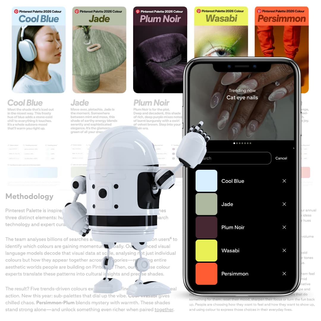
How Pinterest identifies its colours of the year
People who use Pinterest
Pinterest analyses billions of searches and saves from over 600 million users to identify colours gaining momentum. These real actions reveal emerging preferences long before trends peak.
Visual search technology
Pinterest’s visual AI examines images across the platform to understand which colours and combinations people are drawn to, uncovering the aesthetic worlds they are actively creating.
Human curation
In-house colour experts translate this data into cultural insight, mapping trends to specific shades and validating them across fashion, beauty, interiors and other key categories.